Lake Arlington Facility Rebranding
Creating a Cohesive Identity for a Community Destination
As part of a larger Arlington Heights Park District rebranding initiative, I led the visual refresh of Lake Arlington. The project introduced a new identity and coordinated signage system designed to guide visitors, share information, and reflect the character of the recreational site.
- My Role
- Project Manager, Lead Graphic Designer
- Tools
- Adobe Illustrator, Adobe InDesign
- Responsibilities
- Brand Identity, Logo Design, Environmental Graphics, Wayfinding, Interpretive Signage, Vendor Coordination, Print Production, Event Promotion
The Challenge
Lake Arlington needed an identity that felt distinctive to the facility while remaining connected to the Arlington Heights Park District's larger brand. The system also needed to function across different types and scales of signage in an outdoor public environment.
The Solution
I developed a cohesive visual identity and signage system that combined clear navigation with educational and recreational information. The final system included the facility logo, identity guidelines, entrance signage, wayfinding materials, interpretive displays, and grand-reopening communications.
Reopening & Construction Communications
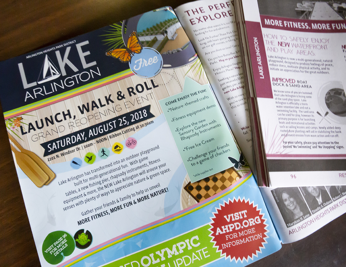
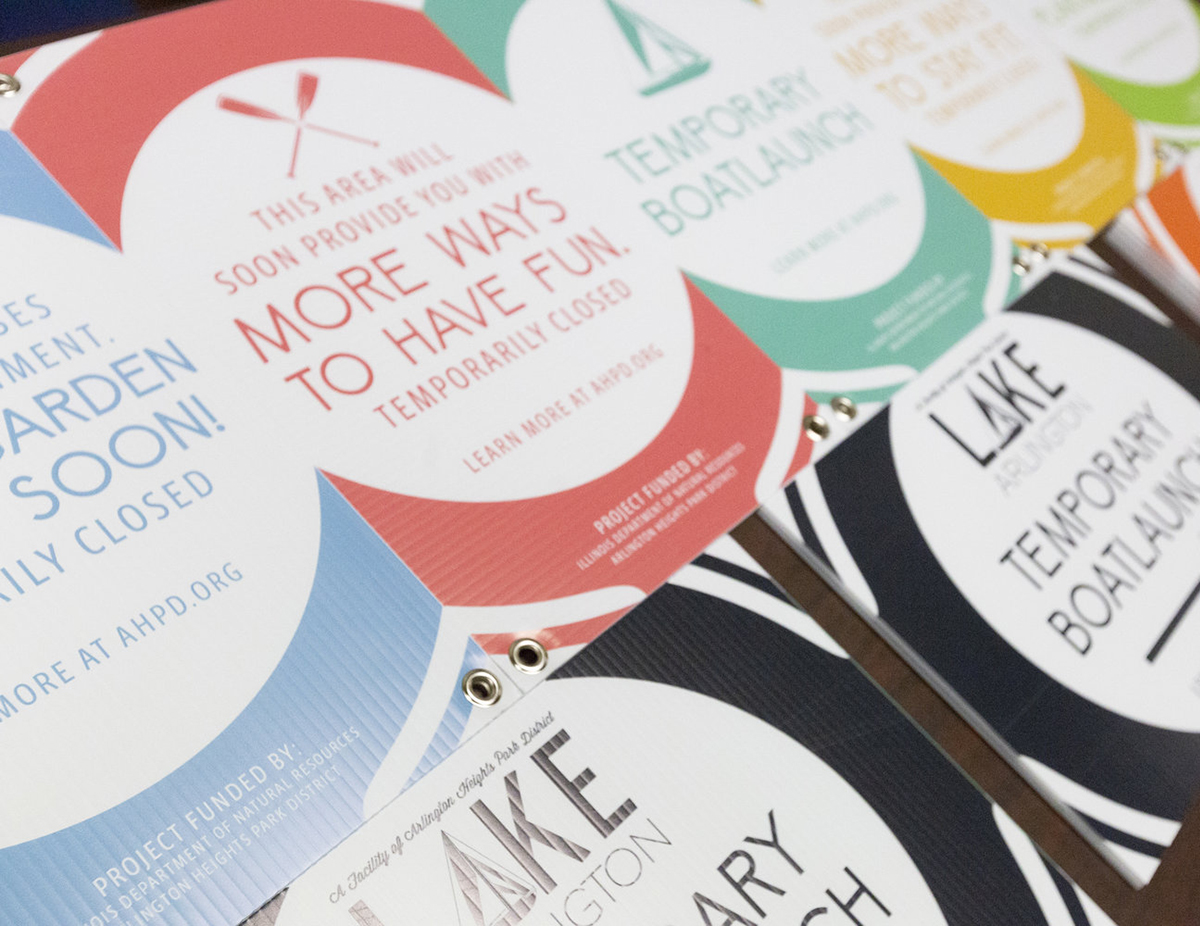
To build awareness for the updated facility, I designed a brochure promoting Lake Arlington's grand reopening. During construction, I also created temporary signage that communicated closures and upcoming improvements while giving visitors an early preview of the new visual identity.
The New Facility Identity
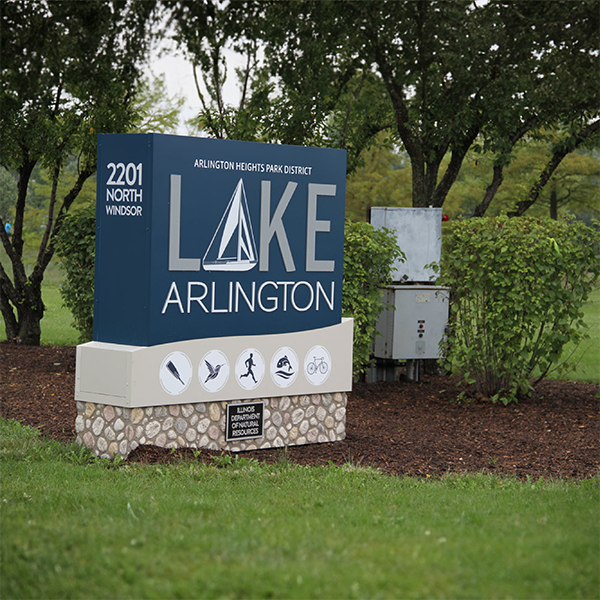
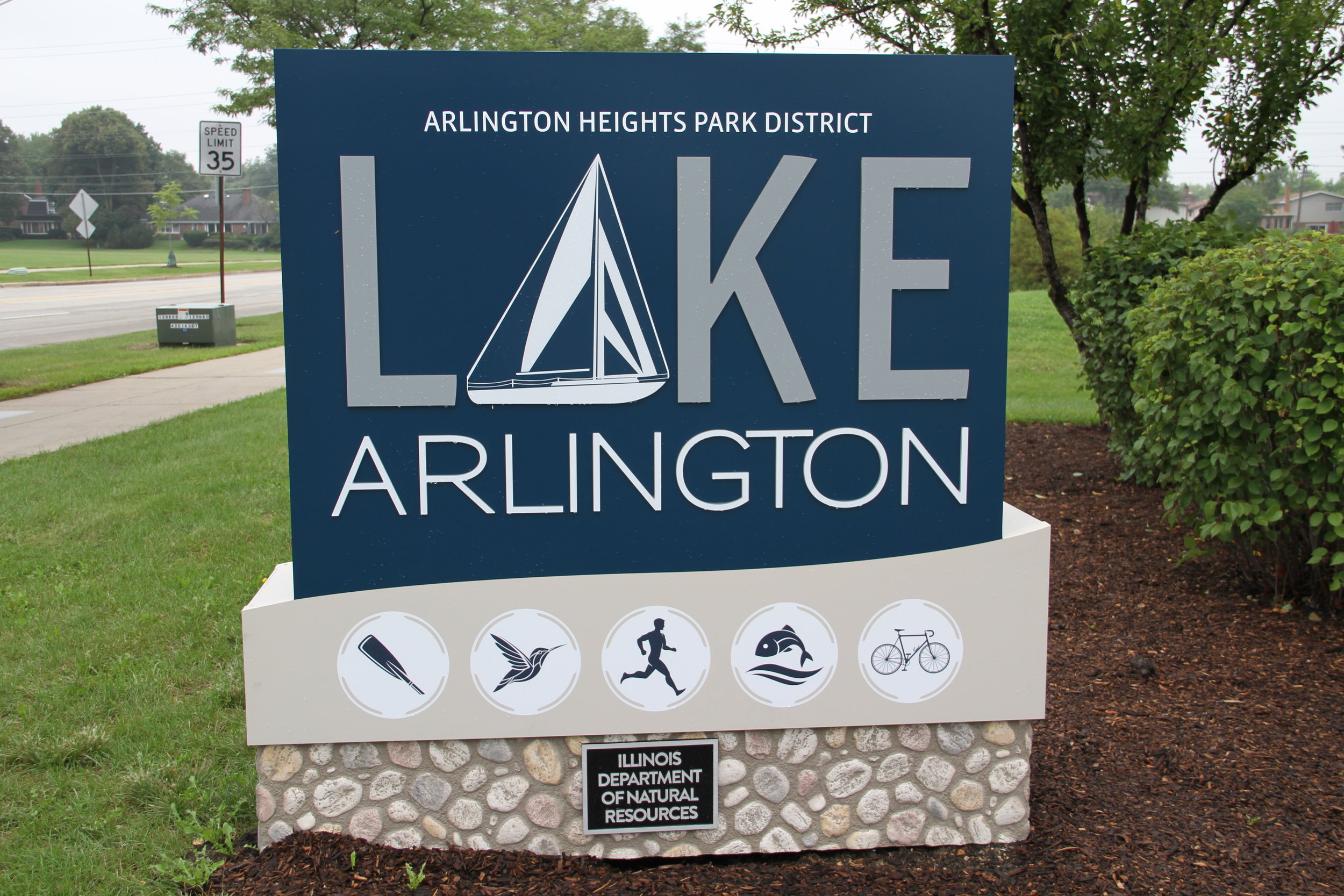
The finished entrance sign introduced the new Lake Arlington identity at a highly visible scale. The sailboat logo reflects the character of the facility, while custom activity icons highlight the recreational experiences available throughout the park.
Visitor Information and Engagement
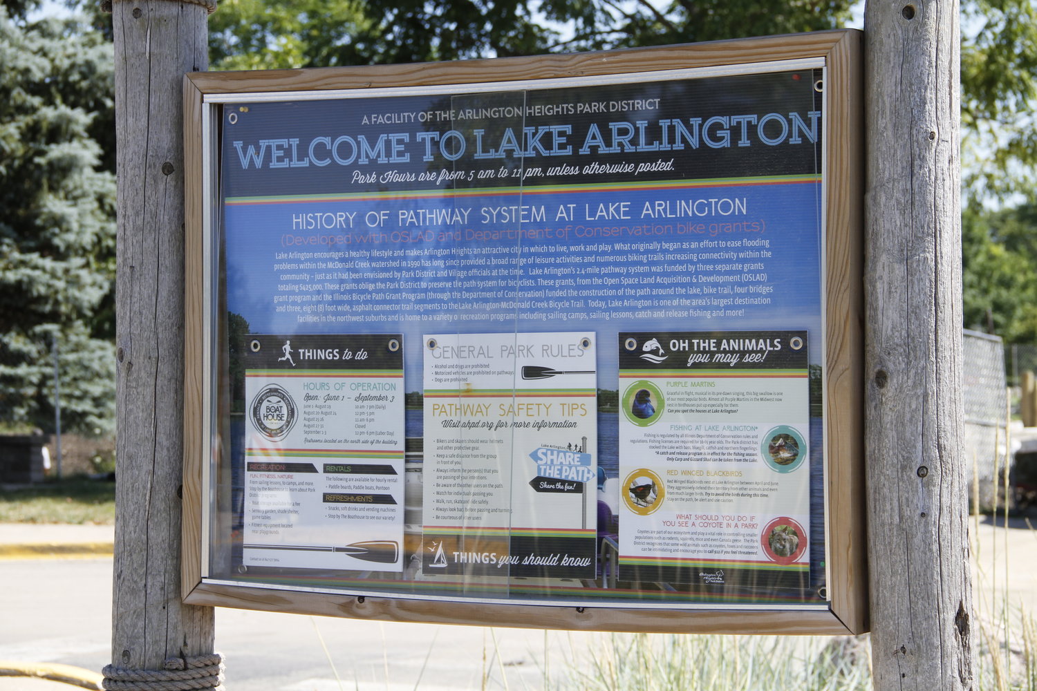
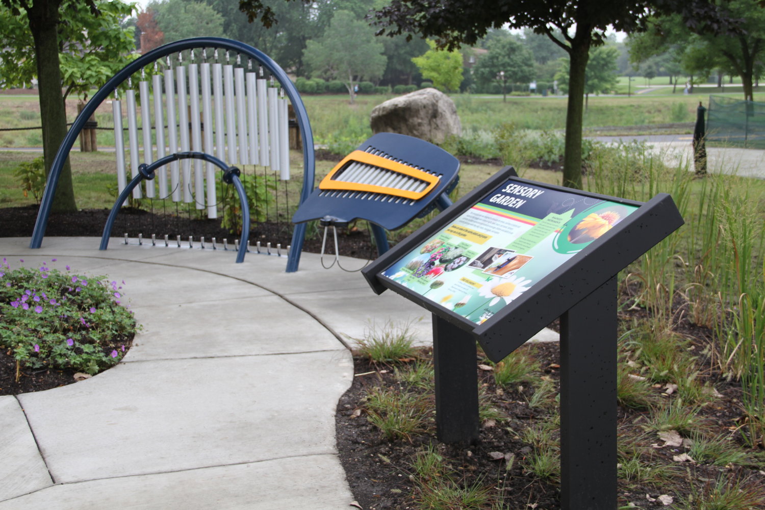
The signage system extended throughout the facility to help visitors navigate the space and engage with their surroundings. A central welcome display provided essential facility, pathway, safety, and wildlife information, while smaller educational signs encouraged discovery throughout the park.
Interpreting the Lake's History
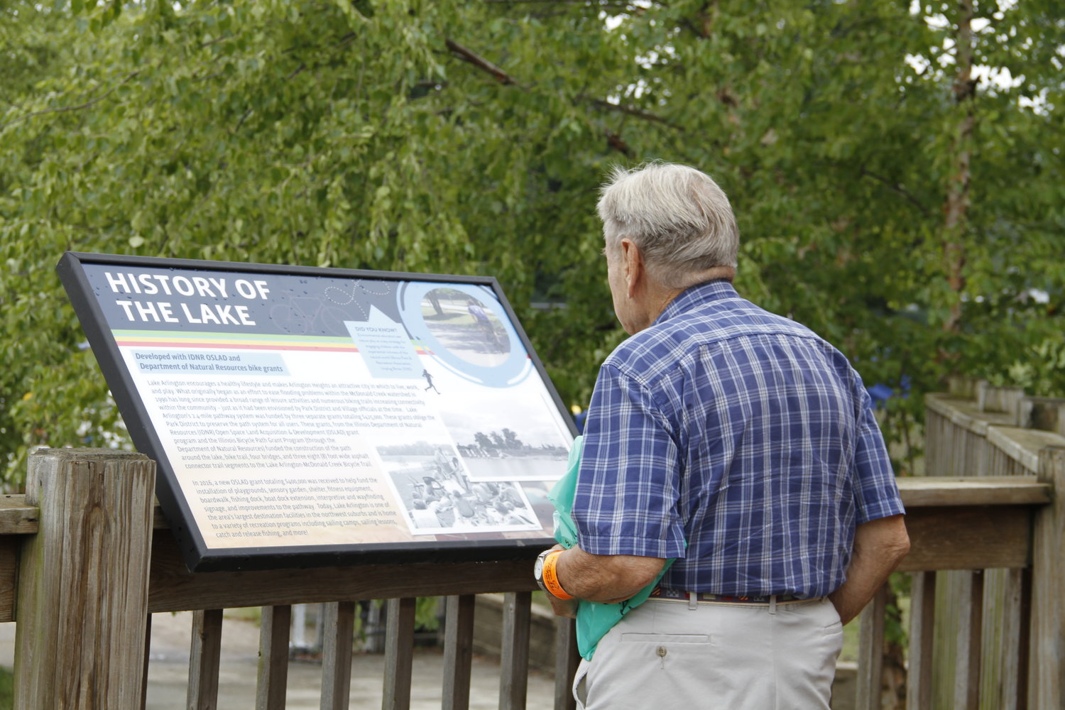
Interpretive signage also shared the history and development of Lake Arlington. The displays combined archival imagery, educational content, and the new visual system to make the site's story accessible to visitors.
Project Management and Production
As project manager, I coordinated vendor outreach, collected production and installation estimates, and worked with selected partners throughout fabrication. I reviewed deliverables to ensure the finished signs and communications met design, quality, budget, and scheduling requirements.
Final Outcome
The completed rebrand created a consistent visitor experience before, during, and after the facility's reopening. From temporary construction communications to permanent entrance and educational signage, each element helped introduce the new identity while guiding, informing, and engaging the community.