Grovepath's branding and website felt outdated and didn't reflect their innovative approach to software development, making it harder to connect with clients and stand out in the industry.
I led a full brand refresh—updating the logo, colors, and website design—and worked with a developer to bring the new look to life, creating a modern, cohesive identity that better represents who Grovepath is today.
At the beginning of the project, I made it a priority to improve my understanding of the issues plaguing our end-users. During discovery, our two goals were to truly empathize with our end-users while also challenge industry assumptions. To accomplish this, I took advantage of these research techniques:
Heuristic Analysis & Redlining Annotations
Competitive Analysis
Personas
Process Flows
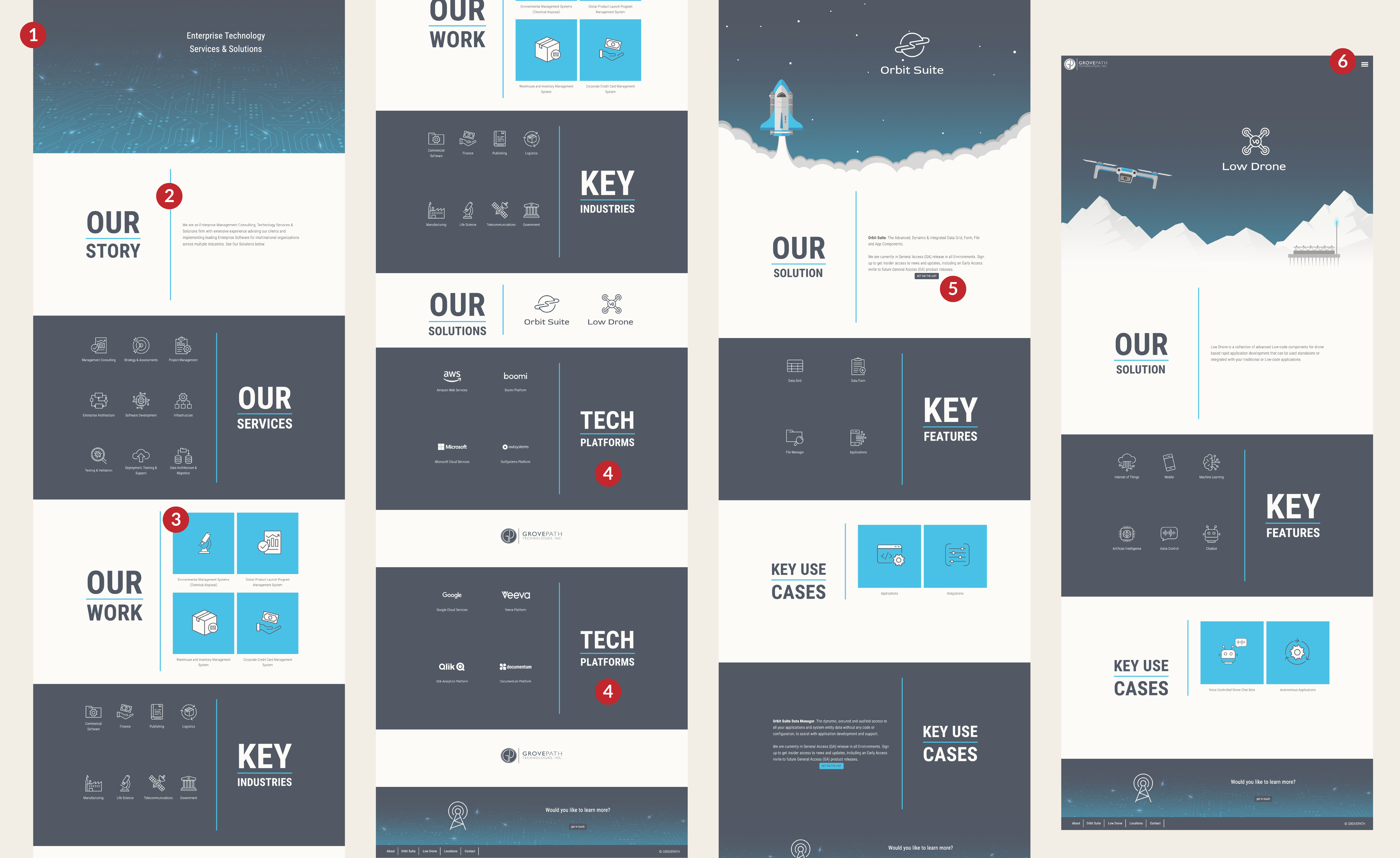
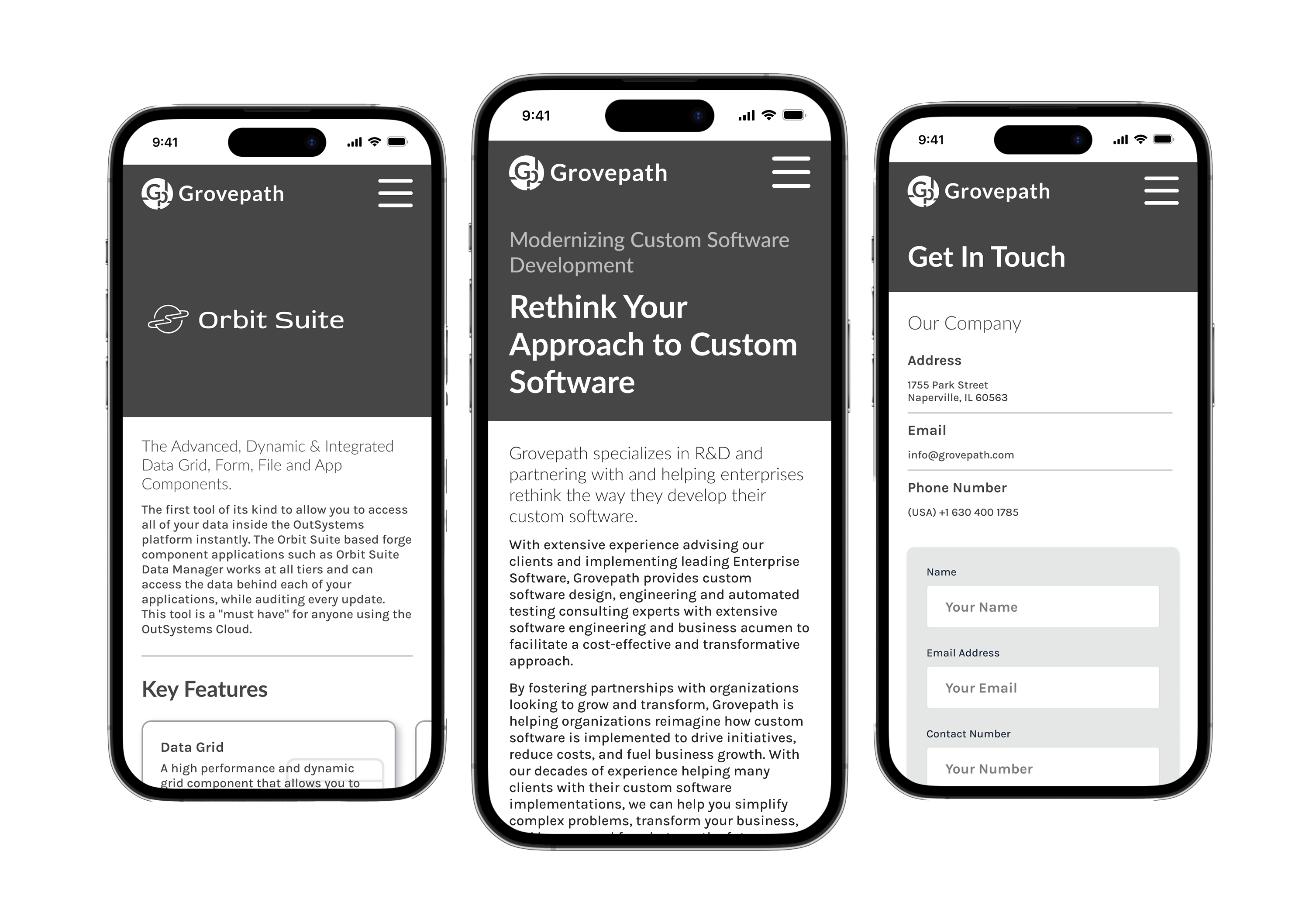
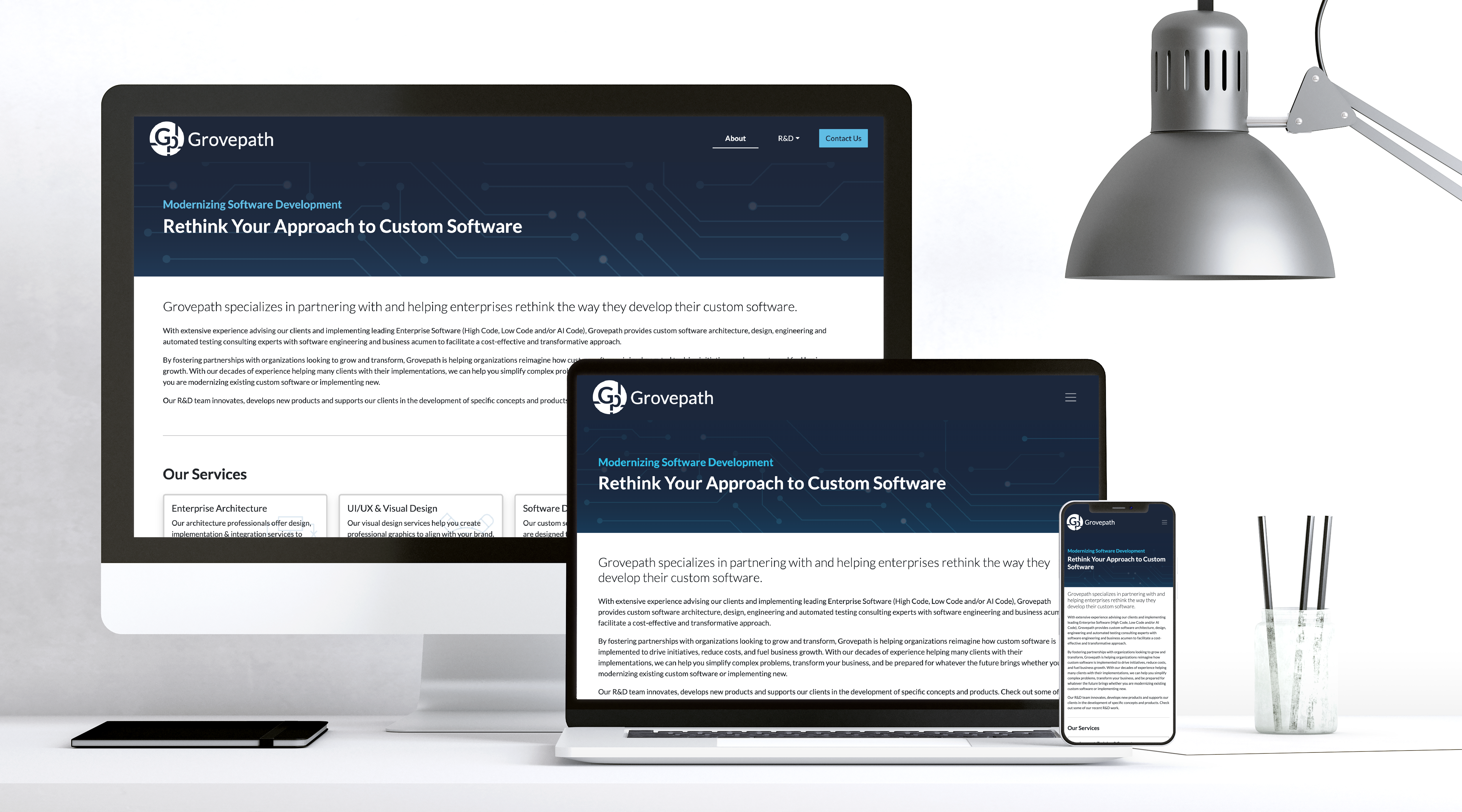
During the heuristic evaluation and Redline Annotations exercise, I uncovered pain points in the navigation, layout, and visual hierarchy that hindered user understanding. In the images above, you can see some of the areas that I marked for improvement.
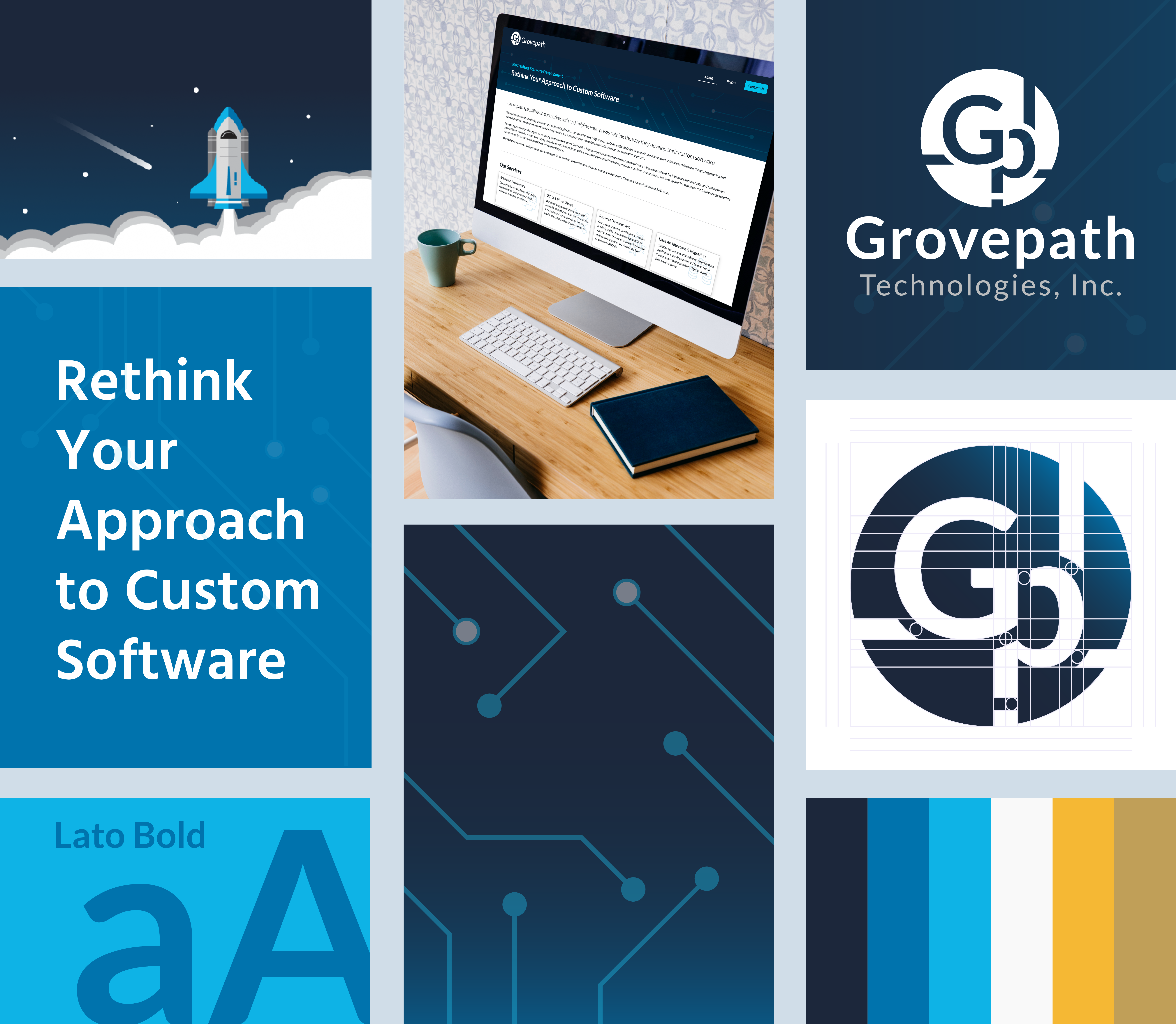
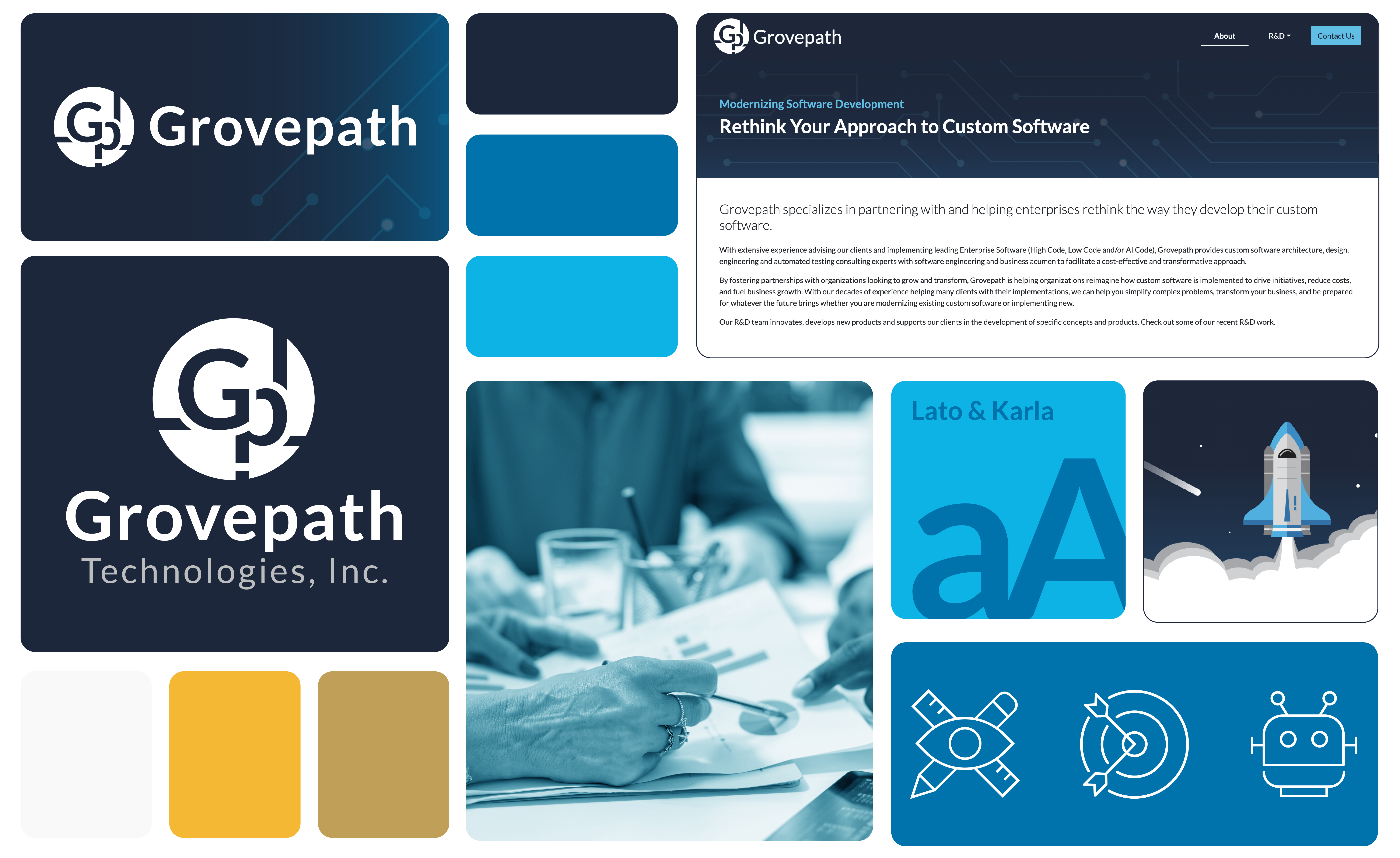
I used the insights from the evaluation and annotations to inform a cohesive visual language—including type, color, spacing, and UI patterns—that can scale across all Grovepath brand touchpoints. This creates a foundation for a refreshed brand identity that's both professional and user-friendly.
I conducted a word association and brand attribute mapping exercise to better understand the personality Grovepath's refreshed brand should convey. This process helped distill keywords such as “innovative,” “agile,” “trustworthy,” and “intelligent,” which aligned closely with Grovepath's mission to modernize software development. These insights laid the foundation for design decisions, ensuring that the visual identity would resonate with both the company's values and its target audience.
After aligning on key brand traits and gathering input from the stakeholder, I began the sketching phase to explore visual representations of the new identity. This step allowed me to quickly iterate on logo concepts, typography arrangements, and layout ideas in a low-fidelity format. Sketching helped translate abstract ideas into tangible direction, serving as a bridge between strategic thinking and visual execution.
I built and iterated on a lot of wireframes while going through the design process.
Working on the Grovepath brand refresh challenged me to balance strategic thinking with creative execution. It pushed me to refine my approach to visual storytelling—ensuring that every design decision was intentional and aligned with the brand's purpose. This project strengthened my ability to listen closely to stakeholder input, translate abstract concepts into cohesive visuals, and deliver a polished system that felt modern, trustworthy, and uniquely Grovepath.