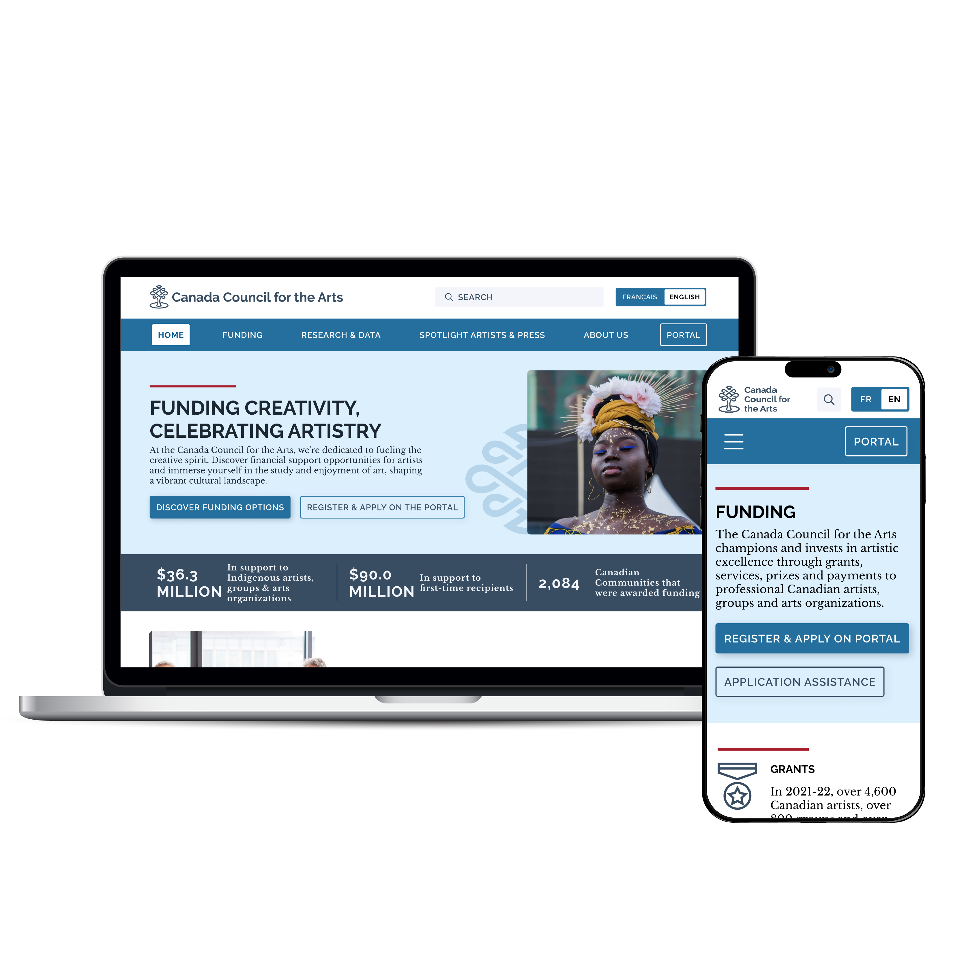
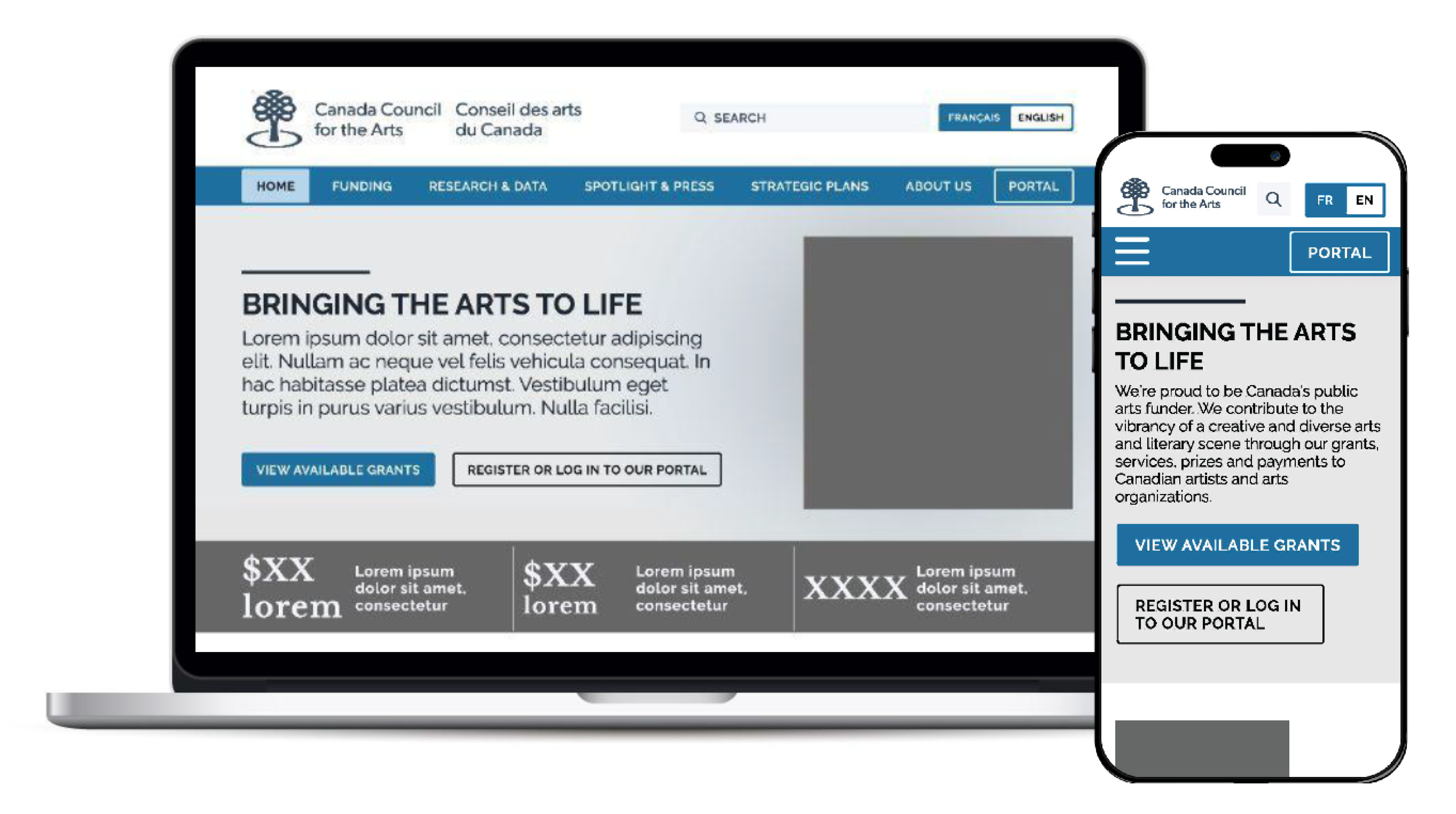
Canada Council for the Arts Website Redesign

Funding Creativity, Celebrating Artistry

This redesign aims to enhance user experience by improving navigation, accessibility, and visual appeal, providing a more effective platform for artists and arts enthusiasts to access funding and opportunities.

My Role: UX/UI Designer

Team Members: 2 (for Discover and Define Phase)

Time: 5 weeks

Tools Used: Adobe Illustrator, Figma, InVision

Canada Council for the Arts Redesign

Problem

The Canada Council for the Arts website has issues like unclear buttons/call to actions, too much information on the homepage, and color problems that make it hard for users to find what they need, especially when they're trying to get funding for their art projects.


Solution

Redesign and simplify the website to engage users and ease their ability to research and apply for funding.

Design Process

Design Process

Qualitative Research

The goal was to understand specific information users wanted when looking for funding opportunities and support for their artistic pursuits to help ensure that the website provided clear and relevant information to its users as well as gave users a pleasant experience while navigating the CCftA site.

5

1-1 Interviews

Artists looking for funding for their projects and art communities

3

Tasks

Find support programs, find out if users are able to get a grant, & put in an application
“It's sterile clean. Someone thought about it, but someone needs to think a lot more about it.”
“It's kind of hard to tell what I am supposed to be doing with this site. I think the layout is clean and simple but I am not drawn to any particular thing immediately.”
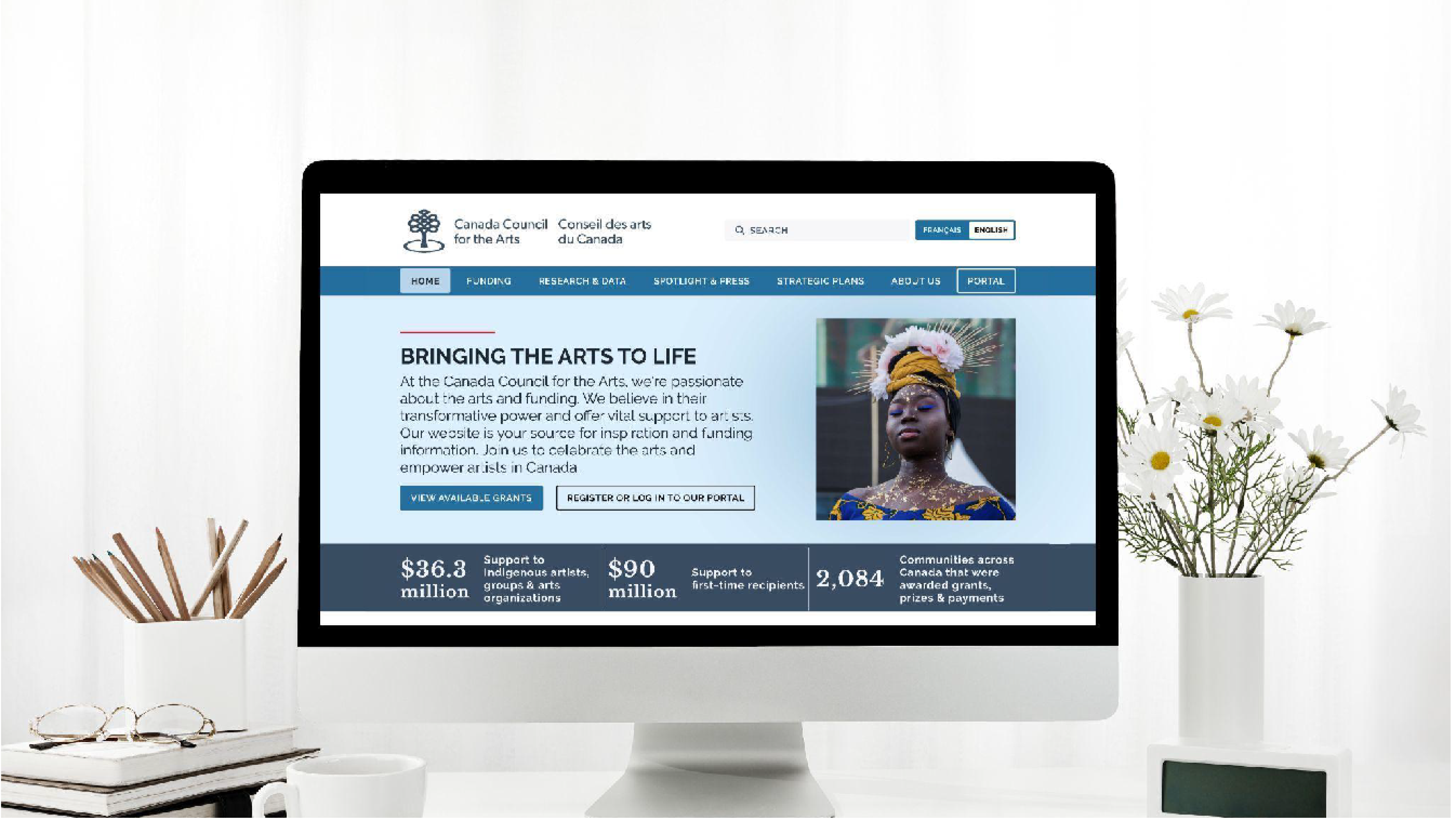
Key Learnings

Parts of the website need clarity like Portal access page and the featured homepage section

Navigation needs to be streamlined and it's hard to get back to the homepage

There is inconsistent icon and button treatment

No relevance to hero and card images

Heuristic Evaluation

Heuristic Evaluation

Competitive Analysis

Competitive Analysis

Canada Council for the Arts Original Color Analysis

The Canada Council for the Arts website currently has a split complementary color palette. Unfortunately, after further inspection it is found that the 3 secondary colors do not fully pass AAA standards with regular text and the secondary blue doesn't pass regular, large or the graphic components test.

Recommendation: Adjust the colors to allow for better readability for all viewers including the visually impaired. Also bring in Canadian color palette to tie into canada government branding so users understand it is government funding.

Original Color Palette

User Persona

User Persona - Image found on freepik
Age: 33
Location: British Columbia
Industry: Painter
Income: $29 per hour

Sadie James

“I'm not sure that I can maintain the lifestyle that I want with just my art. It's really hard to find different funding opportunities right now.”

Interests

Art

Participating in Workshops

Traveling

Museums Exploration

Festivals

Needs & Goals

Access to financial Aid

Information on gallery opportunities

To be able to live off her work

Money for supplies to make her pieces

Pain Points

Difficulty making a stable income from selling her pieces on her own

Issues getting her name more widely spread and recognized. Finding a reliable community and networking would help her find more opportunities so promote her pieces.

Her work is expensive to make between the canvases, paints, etc., additional funding would really help her.

User Path

Artists would typically want to go to the Canada Council for the Arts (CCftA) website to find funding opportunities, grants, and resources that can help fund their artistic career and to achieve higher visibility in the art world.

The task for this user is to find funding options offered by CCftA and then apply for a grant.

User Path

User Testing Navigation Summary

Objective

Identify pain points in the Canada Council for the Arts website navigation.

Tasks

Discover support pages of the site. Understand what the site offers.

Methodology

6 user tests: 3 on the website version, 3 on the mobile version.

Common Issues

Users get frustrated and confused with the numerous levels within the navigation. They did not want the levels to go past 2.

The mobile tests has the most issues as it seems the website loses some of its information when its converted. Breadcrumbs go away, banners that tell the user where they are, etc.

Users got lost in the site as well. Although the website does have some breadcrumbs, it still doesn't highlight what page the user is on.

Information Architecture

Card Sorting

After conducting the Navigation Usability Sessions, I streamlined the navigation to just one level because multiple levels confused users. Also, some of the tabs didn't have drop downs which made users think the navigation was broken. In doing this, I also combined some pages such as Spotlight & Press and moved Priorities to the About Us section named Strategic Plans.

About Us

Priorities

Public Accountability

Strategic Plans

Funding

Grants

Prizes

Strategic Funds

Research

Research Library

Stats & Stories

Sitemap

Sitemap

Brand Style Guide

UI Style Guide

Wireframes

Wireframe Desktop Home & Mobile
Iteration Desktop Home

Lo/Mid-Fi Usability Tests

Objective

See if users can figure out what CCftA is about and if users have any issues navigating the site.

Tasks

Describe the purpose of the site and determine if user could get around simply.

Methodology

Perform 4-5 five-second tests on the homepage prototype and ask them to get to a grant.

Results

User's at first still had a hard time telling what the page was about at first glance. “Bringing the arts to life” headline was not helping users get context. They could tell it was about art and funding but not about if it was asking for donations or geared towards artists who actually needed funding options.

Key Changes: Changed the tagline to state clearly what the main point of the site is for: funding artists and promoting the study and enjoyment of art. Then I adjusted the paragraph below to represent the same and changed the “View Grants” button to “Discover Funding Options.” Users following change all understood the purpose of the site. I, also, found that users didn't want so many options still in the navigation header so I moved “Strategic Plans” into the “About Us” tab to give more breathing room. Users were able to clearly get around the site and “loved the easy, clean design” with clear call to actions.

Key Learning from Hi-Fi Usability Tests

Key Learnings Diagram

Hi-Fi Desktop Prototype Pages

Hi-Fi Prototype Pages

Desktop Prototype

iOS Prototype

Final Thoughts

After analyzing the feedback I received from my user tests, I was able to go back and make updates to all the high and low priority pain points for the users and Canada Council for the Arts making the site a better experience for all involved.

All users tested loved the new design of the site and were able to grasp the purpose immediately.

Canada Council for the Arts empowers artists to pursue their dreams and share their work with the public. CCftA strives to inspire and encourage artists and their community to grow and further their development with the arts.